Designed to offer a seamless and user-friendly experience for health insurance affiliates.
This app serves as a comprehensive tool to manage their health coverage, access vital information, and utilize a range of services provided by their health insurance provider.
This company had an old app which was designed and developed by the engineering team ( there was no design team). Tekhne hired me and my colleague to handle the design for this app and many other projects, that is to say that were the only and first designers there, there was no documentation whatsoever for this product. So we started from scratch.
Considering the fact that there was already an existing app, the challenge was to asses it, and redesign it for a better experience.
The (or my) Design Process
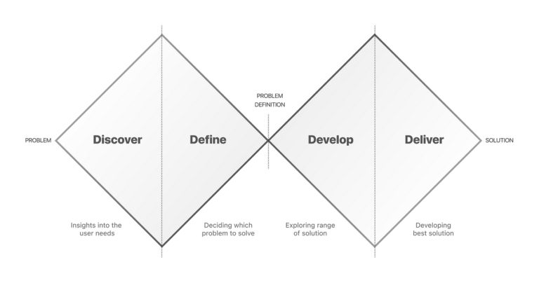
Double diamond methodology was the approach i have been using from industrial design (my background carreer) and ux design. Very useful. I then redesigned it for having testing and iteration as it’s never a linear process but a dynamic and complex one.
First thing first. How are we doing on...? - Research and Data
As I already mentioned before, there was no design team or someone specifically in charge of the product itself. So, as part of the new design team, I was asked to redesign the app but we didn’t have any real data or problems we had in the app. Besides from the exploratory research I did myself in which I found many “ux” bugs, and the questionable aesthetics of the previous app (which was outdated) I needed some information where to stand on.
The budget for this project was too low to do many interviews or go out there to do usability testing, so I decided to dig into the backend to get some analytics and also we decided to analyse one client (social service entity) which is currently using the app.
The results were astonishing, many problems aroused, some due to design and others related to the service itself, to politics, and many other things. To focus on what we could handle, three of the most important issues were chosen.
Competitive analysis. User personas. Etc. - Research
After knowing some of the problems we were, hopefully, going to be solving we made a competitive analysis of other apps, services or user flows to know how were they doing or trying to solve the same problems.
Own analysis. Looking in depth. What we were doing. - Research
Regarding another analysis we looked into the app to find out what were we dealing with. We had many elements to consider, and we asked why they were there. If I’ve learned something in design, or better yet, studying the philosophy of good design, it’s that every detail needs to be carefully considered and should serve a purpose.
1 month or 1 year? Defining the scope of the project.
So the problems were defined, and we knew what we were dealing with, it was time to define what we were going to do and in what timeframe we needed to do it.
And only now, crafting solutions...
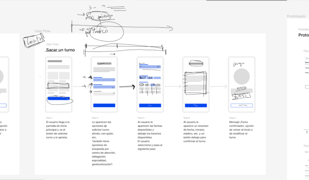
User flows - Ideation and Design
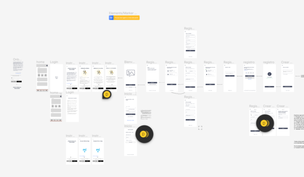
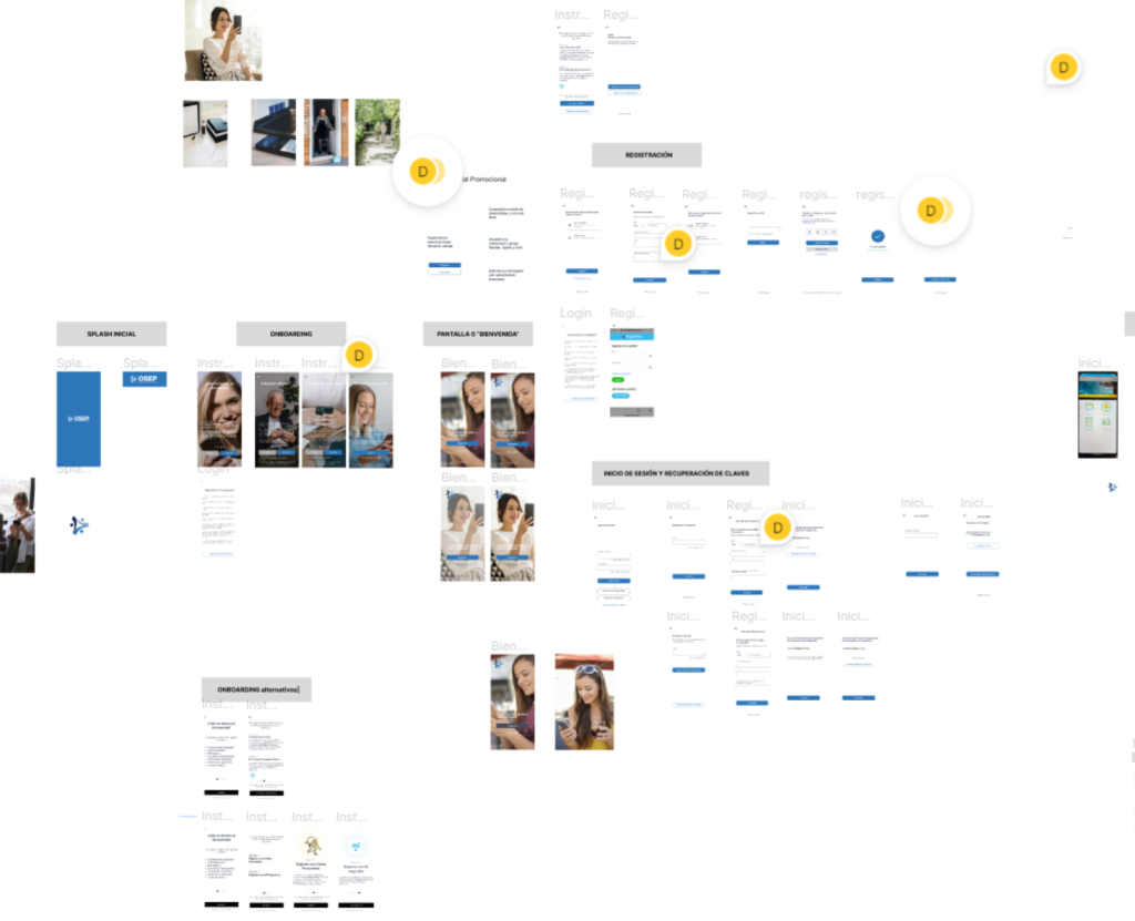
Only then, we were able to craft possible solutions for these problems. One of which was the registration flow.
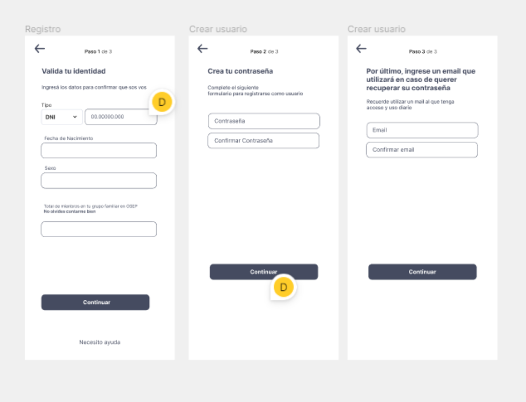
Users have been having problems with the registration flow, they forgot their passwords and their recovery email. So one of the firsts tasks was to generate ideas to solve this issue. First by hand, then some wireframes low fidelity and finally the high fidelity ones. Low fidelity wireframes were really useful because we could go back and forth with many details quickly.
Designing for white spaces too
Although is ui field, considering the whole experience also includes white spaces, they too say something.
Back and forth with the engineering team - Testing, validation
After creating numerous wireframes, we developed detailed flows and specifications for every aspect of the registration process, onboarding, registration itself, and the home screen. Each segment had its own unique characteristics, with technical constraints also playing a significant role in this phase.
Adding look and feel
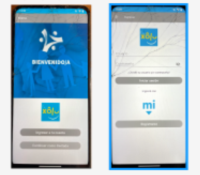
Before
After
What is was done
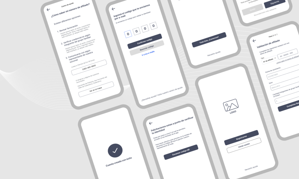
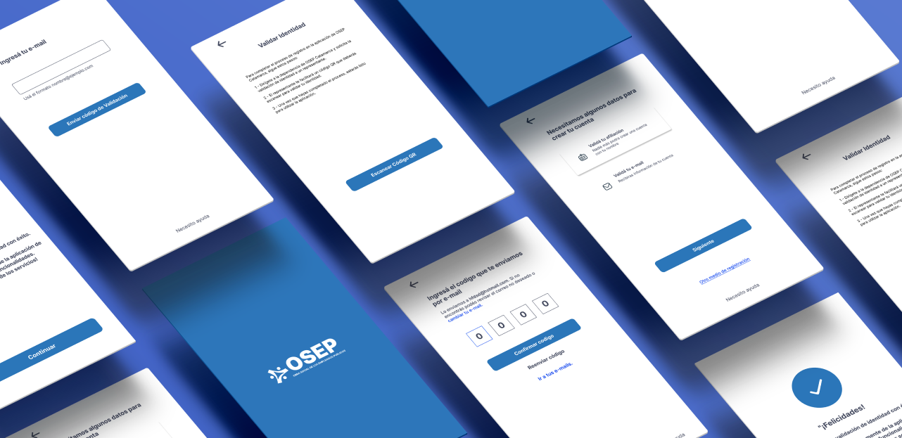
Improved Registration Experience:
Implemented enhancements to facilitate recovery of forgotten verification emails.
Introduced an onboarding process to educate users on key details during registration.
Added email verification for enhanced security.
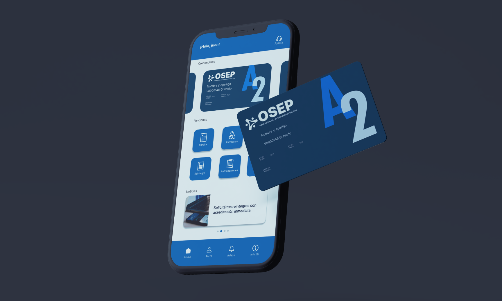
Redesign of the Home Menu
Conducted a redesign of the initial home menu.
Organized key functions to be more accessible and prominently featured.
Prioritized important features at the forefront, followed by secondary functions.
Aesthetic Redesign: (this was done in collaboration with my colleague)
Undertook a comprehensive aesthetic redesign.
Updated visual elements to improve overall user interface aesthetics.
Ensured visual consistency and alignment with modern design principles.
What could be improved
As we tackled this project, we focused first on improving the functionalities we discussed. Some parts of the app still need work, so we decided to handle those later. I also suggested bringing in a product owner to keep track of future improvements for the app
What I learnt
This project was deeply satisfying because it involved not only overcoming UX challenges but also mastering various critical processes such as refining project scope to align with user needs, efficiently managing timelines, engaging stakeholders effectively, and conducting productive meetings. These experiences have significantly enriched my expertise in UX design and underscored the importance of comprehensive project management. I look forward to applying these insights in future projects to continue delivering meaningful user experiences.